Thursday, January 31, 2013

Stained Fingers on Thursday - A Review of Diamine's Blue-black Ink

Hello all,
Here it is, at last - the first of my Stained Fingers on Thursday ink reviews! For this first, regularly-scheduled review, I wanted to post an ink that I enjoy a lot. My review sheets will typically not be as messy/full, as this one is, but I hope that all of the content on this sheet gives you a good feel for this ink's behavior. A few notes on this review:
  • Despite it only saying "cartridge" at the top of the page, some of the review is done with bottled Diamine Blue-black, and I found no major difference between the two, as far as color is concerned. 
  • The Ink Characteristics tests were performed with a Pilot Pluminix, and the results are for that pen, which is a fairly dry-writing fountain pen.
As always, I welcome questions and comments, and I look forward to hearing your thoughts about this new addition to my blog. If you have suggestions for how Stained Fingers on Thursday could be improved, please let me know! Without further ado...may I present the review!


Edit on March 3, 2013: Re-uploaded the scan to include the TWSBI Vac 700.

This review was scanned at 600dpi on an HP Officejet 6500 E710n-z.
Note: Because these scans are done with a light emitting printer, actual colors will, more likely than not, be slightly darker than they may appear, here. The colors shown, here, are probably a bit more reminiscent of what the ink would be like under a bright light or if it were held up and viewed with a light behind it.

The Grip of the Jinhao x750 and Comparisons

Recently, after posting my review of the Jinhao x750, I was asked, via a thread on The Fountain Pen Network forum, where my fingers hold the pen on the grip section and, if such a grip were comfortable. This question raises a good point in regard to general pen design, because a long nib, as the x750 has, often forces the hand to grip the pen closer to the nib-end, in order to compensate for the extra length. What I found was that my own hand actually gripped the pen partially on the accent ring and partially on the grip itself. While this may sound like an awkward positioning, it seemed relatively comfortable to me. I thought that I should share my full reply, here:
"Because the grip was entirely cylindrical, as was that ring, I found it comfortable. It certainly was not awkward, as it might have been, had I been using a pen like a Lamy Safari with the triangular grip that near-on forces you to hold it on the grip itself. Likewise with the grip on the Jinhao/Bülow x450, where part of the grip is a set triangular, textured area. If that pen is not held on that area, there is some discomfort. An important extra point here is just how short the grip section on the x750 is, as compared to the Safari or the x450."
A photograph seemed the best way to show such a comparison. From left to right: Jinhao x750, Bülow x450, and Lamy Safari:


I hope that this also helps you to get a better feel for the Jinhao x750 and all that it offers! Please feel free to post comments or ask questions, below.

Wednesday, January 30, 2013

Announcing InCoWriMo!

The gentlemen at FPGeeks have developed a wonderful idea in which I urge you to participate! Inspired by the event known as NaNoWriMo (National Novel Writing Month), InCoWriMo (International Correspondence Writing Month) "...challenges each of us to write and mail/deliver one letter, card, note or postcard every day during the month of February." (from the FPGeeks InCoWriMo announcement, here.) More information can be found at the official InCoWriMo website, here, including this printable calendar for scheduling your daily letter/postcard/note writing. I wish you all the best in meeting your personal goal for InCoWriMo! If you are interested in sending me a letter/postcard/note (and receiving one in return), feel free to utilize the contact link on the right side of the blog.
Enjoy!

Black and Silver Class


Here are a couple of photos that I took, while working on the pictures for the Jinhao x750 fountain pen review. The pens in these pictures are the Baoer Skywalker fountain pen and the Baoer Skywalker rollerball pen. The cufflinks are of an unknown brand.


Coming Soon - Stained Fingers on Thursday!

As I worked on the details for posting ink reviews on each Thursday, a proper name continued to elude me. However, when I considered all of the (sometimes) messy, hands-on work that I have done with ink, it came to me. Thus, the name for Thursday's ink reviews shall be ... "Stained Fingers on Thursday." (At least, for now.) Look for the first one to be released, tomorrow. These will primarily be scans of a standard ink review form, accompanied by my thoughts, which range from in-depth musings to the first thing to come to my mind, while using the ink. Additionally, when I use the ink in a new pen, I will update the old review for the sake of comparison. I will do my best to adjust the scans, as possible, for color-realism. Sometimes, it can be difficult to get a scan to properly reflect the true color of the ink, so I highly recommend, if you like the look of one that I post, here, that you view sample swabs on other websites, in order to compare them. Recommended sites for comparing sample swabs include inks at Anderson Pens, inks at The Goulet Pen Company, and inks at iSellPens.com.

I look forward to hearing your thoughts on the new content! Please feel free to post any comments or questions.

A Review of the Jinhao x750 Vertrag Fountain Pen


First Impressions (7)
The elegant simplicity of this pen is impressive, and the simple, black lines are very sleek. The slight taper at the end of the barrel is a bit odd/out of place, as is the silver accent ring at the end, whose raised surface appears to serve no purpose.
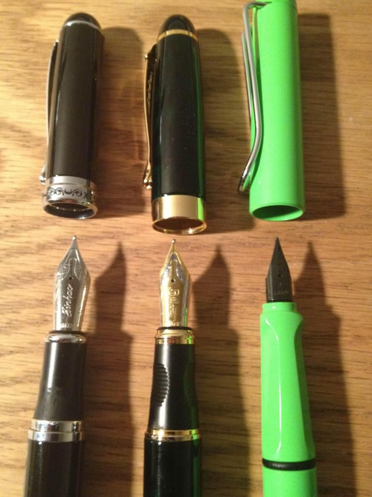
Appearance (8)
In this pen, just as they did in the Jinhao #159, Jinhao seems to be channeling their inner Montblanc, using silver clips, barrel rings, and section fittings to offset the shiny, black fields that are the surface of the pen. While not quite as giant as the #159, this x750 still looks big and is quite a long pen (as long as a Lamy Safari, almost exactly). The nib appearance must be mentioned - it looks positively massive. However, this mirrors my past experiences with Jinhao nibs (at least, in the case of the #159. The Century had a much smaller, two-tone nib).
Note: The wear on the grip section is from use, not the default look.


Design/Size/Weight (7)
Being mostly made from some sort of plastic with metal accents and fittings, this pen has some significant heft to it. In addition, the grip follows the design of the body and is relatively big and thick. This is probably not a good pen for people with small hands, though I cannot personally speak to the truth of this statement.
The black engraving on the cap band is clear and flawlessly done, subtly complimenting the design of the pen, rather than distracting from the overall subdued design. The clip is designed to be hefty, and it could probably withstand being clipped to a pocket were it not so tight. This brings us to my least favorite aspect of the pen: how the cap is seated. First, the cap snaps onto the body in a manner that can only be described as difficult to cap. Once the cap has been applied, it holds to the body with a death grip, requiring significant force to remove it. While the concept, here, is admirable - to design the pen so as to prevent idle uncapping - this pen takes that too far, assuming that it was ever actually part of the design, intentionally. Cap woes do not end there. Another struggle would be reached by those who seek to post the cap. Posting is something that I, personally, do not do, preferring to hold the cap or set it near my writing surface. However, in my attempts to post the cap, I discovered three things. Remember the raised accent ring on the end of the barrel? First, I further confirmed that it serves no functional purpose, such as holding the cap in a posted position. Second, it appears that the only way to firmly post the cap is to jam it, as far down over the end of the barrel, as possible. Third, any other attempt to post the pen results in a loose cap that throws off the balance, in my opinion, while holding it.


Nib (8)
The nib is huge - there is no other way to say it, yet its medium width is not much narrower than a European medium. In part on account of the feed design, this nib is a very wet writer, which can lead to some spread on various paper. Overall, the nib is quite smooth for not being high-priced.

Filling System (9)
This pen is a standard cartridge converter. Unlike some Jinhao pens, which come with very cheaply-made converters, this one’s converter is a very solid and non-flimsy plastic. The use of standard international cartridges (long or short) in this pen is a plus, in my book, versus the use of any proprietary cartridges. Overall, a well-designed and well-chosen option for the filling system is used. To access the cartridges or converter, the barrel is simply unscrewed from the section. Also, the barrel is long enough to store a second, short, standard international cartridge, if desired.


Cost and Value (6)
It should be noted, for clarification, that this x750 is the original Jinhao version and not the modified and re-branded Bulow version, as sold by xFountainPens.com/Paramount Goods, LLC. While I do not feel that the approximately 15 USD for this pen is extravagant (the pen certainly has solid construction and decent quality to it), it may be about 50% more than the pen is actually worth.

Conclusion (8)
(7.5 actual score)
In closing, I can really only see two very broad situations under which the purchase of this pen would be a good idea. The first is, if you are wanting to try a pen by Jinhao. This and the Century (also by Jinhao) are good-looking pens that should provide a decent writing experience with little adjustment of the nibs. This leads into the second scenario, where you are looking for a fairly inexpensive pen. In this area, Jinhao certainly provides, while also making their pens very functional.
Despite the use of proprietary cartridges, I think I would recommend the Pilot Metropolitan over the Jinhao x750 for a classy-looking pen at approximately the same price point. The nib versatility of the Metropolitan wins over the cartridge and converter difference, and the Metropolitan carries slightly more consistent performance than this, the Jinhao x750.


This review was unsolicited and uncompensated.

Tuesday, January 29, 2013

Tea Review Tuesday Bonus - A Review of Tea Forte's Tea Trays

A Review of Tea Forte's Tea Trays

As a bonus, I decided to post a review that is slightly related to the Tea Forte Cafe cup. I hope that it proves of interest to you all!


Through my use of the tea tray, I have come to determine that it is a wonderful product.
At first, the tea trays seem a bit frivolous. The question that initially came to my mind is "Why would anyone spend money on something created specifically to hold used tea bags, when they could just as easily use a small plate, or even just dispose of the tea bag straight away?"
So, determined to answer this question, I prepared myself some tea (Tea Forte's Orchid Vanilla, as the trays were clearly meant to be primarily used with Tea Forte pyramid bags).
Here were my findings:

Great things about the tea trays:
-They are small, thus conserving the space used on one's desk/table/etc. (This was especially helpful on my desk, which has a lot of papers and other items on it, and where a small plate for used tea bags would be a waste of space.)
-They provide a drip-free resting place in the chance that you want to save the tea bag for another steeping.
-The tea trays are aesthetically pleasing, making them great to give as gifts or to add a bit of decoration at tea time.
-The size of the tea trays is such that they could just as easily be used with other tea bags as drip trays.
-The construction is really solid. These trays are not going to break easily if they are accidentally dropped.

Not so great things (that might not matter) about the tea trays:
-These trays really are not so special and innovative that one would go out and buy them to complete one's collection of teaware.
-The shallow indentation in the tray was not deep enough, and the excess liquid in my teabag ended up overflowing the lip of the tray's depression. (I may not have let the tea bag drip-off for long enough.)
-Because of the shallow indentation, when I picked up the tray to drain it and clean it, the smallest tilt caused tea to run off the edge.


The Tea Forte Tea Trays can be purchased from their website, here.
Photo credit to Tea Forte.
This review was unsolicited and uncompensated.

Tea Review Tuesday - A Review of Tea Forte's Cafe Cup

Here is a slightly different review for you all! I love teaware, almost as much as I love tea.

A Review of Tea Forte's Cafe Cup

I was excited for the opportunity to review this cup, as I had seen it while browsing the Tea Forte website and appreciated the clever-looking design.
In reviewing Tea Forte's Cafe Cup, I decided to create a simple pros and cons list. This is not a complete list by any means, merely a list of the things which most stood out to me.

Pros:
-Comes with a lid, to hold the heat in while steeping.
-The lid keeps your tea hot, even when you leave it for some time.
-The cup is quite pretty, in a simplistic way.
-The hole in the lid is perfect for the tag and string from the tea bag (specifically those by Tea Forte).

Cons:
-The construction of the cup is such that, because of the heat emanating through the walls, it is necessary to hold it by the handle alone.
-The size of the cup in comparison to the handle makes for a slightly awkward or unwieldy experience when lifting a full cup, especially because it seems the handle is not meant to be held with more than one finger through it.
-The lid gets quite hot while steeping tea, which can be problematic when you try to remove it to drink.

The biggest improvement I think could be made to this product is if it came with a saucer, to catch any drips, and provide a resting place for the hot tea cup, so that items under the tea cup are not in danger of being damaged by the heat.
Overall, it is a very nice cup, and the wooden box it comes in makes for a very nice gift presentation.


The Tea Forte Cafe Cup can be purchased from their website, here.
Photo credit to Tea Forte.
This review was unsolicited and uncompensated.

Tea Review Tuesday - A Review of Tea Forte's Orchid Vanilla Black Tea

A Review of Tea Forte's Orchid Vanilla Black Tea

I began by preparing this tea (in my Tea Forte Cafe Cup), following the directions given on the Tea Forte website (steep 3-5 minutes using just-boiled water).
When I opened the cardboard package, containing the pyramid-shaped tea bag, I was immediately struck by the very sweet vanilla smell. It was delectable. The website lists that this tea also contains coconut slivers, and, indeed, traces of coconut were certainly evident in the aroma.
After steeping for three minutes, I decided to remove the tea bag and test the flavor. Upon removing the lid, I noticed the colour was the unremarkable brownish-red of black tea. Then I smelled the tea. The scent of coconut had all but disappeared, and the aroma of vanilla had actually deepened and taken on more muted tones.
With the first sip, I was disappointed. The taste of the vanilla was barely there. I suspected this might have something to do with the length of steeping time, so I put the tea bag back in for another minute. (On a side note, something I really appreciate about the tea bag design is the stiff string, making it easy to move the tea bag around.)
This additional steep complete, I tried the tea again. This time, the vanilla was much more prominent, almost spicy. The liquid itself remained wonderfully smooth. The spiciness was actually a delightful treat, tingling a bit at the back of one's throat as the tea is swallowed.
Sadly, the coconut that was originally smelled when the tea bag was first brought out is nowhere to be found. This could just be on account of the fact that my taste buds are not very familiar with the actual taste of coconut (which, in all fairness, I have only tasted on rare occasions). The vanilla, however, completely makes up for this lack of coconut, in my opinion. It is certainly one of the best vanilla loose leaf teas I have ever had (out of a total of perhaps three to five, as my vanilla tea explorations have not ranged very far).
I would not call the flavor itself rich, but it is certainly not mellow. This seems to be the sort of tea that could be drunk, cup after cup, all throughout one's day. And, with the caffeine it contains, would be an excellent stimulant during long work hours.
To test the stamina of the tea, I decided to steep another cup, increasing the steep time by one minute (to bring it to five minutes total). The aroma is less intense than before, as was to be expected, but the vanilla smell is still deliciously pleasing. The taste is still quite good as well, albeit not as intense as the first cup. The spiciness is gone, but the smooth vanilla flavor remains.
Over all this was a very good tea. If I were to purchase it in large quantities, I think I would opt for buying the loose leaf in a canister, to allow me to vary the amount of tea used per steeping (and also allow me to more easily steep a large pot of it at once). On my personal enjoyment scale of 0-100, I rate Tea Forte's Orchid Vanilla black tea a 75/100.
I just have one final question, that perhaps a fellow drinker, or even Tea Forte could answer... "Why orchid, and where is it?"


Tea Forte's Orchid Vanilla Black Tea can be purchased from their website, here.
Photo credit to Tea Forte.
This post was unsolicited and uncompensated.

Green in Green on Green


Caption: "Green in Green on Green"
Fountain Pen: Lamy Safari, Apple Green (2012 Limited Edition), fine nib
Ink: De Atramentis Green Tea
Tea: Boston Tea Co's Dragonwell green tea

Tea Review Tuesday - A Review of Canton Tea Co's Da Hong Pao (Big Red Robe)

A Review of Canton Tea Co's Da Hong Pao (Big Red Robe)

To brew this tea, I used about a tablespoon of leaves and four cups of boiling water. Steeped in a glass teapot, it was easy to see the leaves as they released a burnt orange liquor. (Later note: Using less water would have certainly improved the infusions.) Upon initially steeping this tea, the first thing I noticed was the incredibly light mouthfeel. After the first cup, the flavor continued to linger in my mouth. This oolong has a much lighter taste than other oolongs I have tried. It is a delicate taste, and very good.
The taste itself...in the first few sips of a cup, one can really taste the leaf, but the flavor seems to fade as one finishes a cup. Perhaps the initial flavor, light as it is, coats the taste buds in one's mouth so that subsequent sips merely slide through over the tongue.
Overall, I very much enjoyed this tea. The strength of the taste was a bit too light for me, but it was still enjoyable to drink. This was very reminiscent of the oolong served in Chinese restaurants with Dim Sum.
Canton Tea Co's Big Red Robe oolong receives a 92/100 for its exceptionally delicate taste, light mouthfeel, and lasting flavor.
EDIT: I later tried resteeping these same leaves. This was a major disappointment, as I got barely half of the original body and flavor. This lack of “stamina” in the leaves significantly decreased my rating of this tea (now an 85/100). In my experience, a good oolong ought to have at least some measure of re-steep-ability.


Canton Tea Co's Da Hong Pao (Big Red Robe) Oolong can be purchased from their website, here.
Photo credit to Canton Tea Co.

This post was unsolicited and uncompensated.

Tea Review Tuesday - The Beginning of the Steep

Here we are with the introduction to the previously-promised tea review posts! I will try to include pictures, when I can, if of nothing other than the tea itself or its container. The official title for these Tuesday sessions shall, originally enough, be Tea Review Tuesday, and I look forward to sharing my thoughts with all of you. A note about my rating scale, when I use it (which is almost always): my ratings are very much enjoyment based, as you will see on the scale. Everything is rated relative (in my mind) to other teas that I have tried and how I felt about the experience. As always, questions or comments are always welcome!

For this first week, I am going to post three different reviews today, for your reading pleasure! Enjoy, and I look forward to your thoughts.

Another note: If you are unfamiliar with the term "steep," it is a verb used in the tea community, which describes the process of making tea through leaving the tea in hot (or sometimes cold) water. For example, "I steeped my tea for too long," means that I left the tea bag or loose leaves in the water for longer than I should have or than I meant to do.

Friday, January 25, 2013

Plans for new content - tea and ink!

Hello, readers! I promised new tea content, and it shall be forthcoming. Starting this coming Tuesday, I shall provide a tea review for you, giving all my thoughts on the various aspects of what I am drinking. Does anyone have any ideas for clever titles for these posts (possibly something better than my idea: Tea Review Tuesday)?

In addition, since ink is such an integral part of this blog, and of the fountain pen user experience, Thursdays will have me providing a review or thoughts on inks, both old and new. Ideas for clever titles, here, are also welcome.

In closing, I wanted to provide you with this random picture of a Lego dwarf, attempting to climb inside my teacup from this morning. Enjoy!


A Review of the Pilot Metropolitan Fountain Pen

First Impressions (8)
This pen looks very nice for such a low price. I use the word classy to describe pens a lot, but classy certainly fits this pen. A formal-looking pen at a low cost is typically something found with Chinese pens (Baoer, Hero, etc.), so, coming from Pilot, this is surprising (in a good way).


Appearance (9)
Inspecting the pen closer, I am impressed further by some things and not as impressed by other things. Capped, the whole pen looks solid, slick, and subdued. Even on the gold-bodied pen, the black center band contributes to the look, rather than appearing to break up the design. Additionally, the option for nine different looks is very impressive. (There are three, matte body colors: black, silver, and gold; and there are three center-band designs: plain, zig-zag, and dots.) I can only speak to the zig-zag center-band design, but it looks cool and slightly art deco (which is exactly why I chose it).


Design/Size/Weight (8)
The part that impressed me less, when I inspected the pen, definitely had to do with the design of the grip section, foremost. Compared to the rest of the pen, it looks and feels a bit cheap, though I know it is a solid plastic, probably the same material from which the Pilot Penmanship, Plumix, and Pluminix pens are made. The cap posts nicely, though loosely, but it snaps onto the body quite firmly. I have never been concerned about it coming off. On the gold Metropolitan, there was one point at which I went to remove the cap and the barrel came detached from the center-band, but this may have been on account of a lack of adhesive, as my black Metropolitan has not had this issue. I suppose this shows how firmly the cap attaches to the body, though removing the cap is not difficult by any means. I would think that other metal objects (like keys) could scratch the body, but I have not tested this (intentionally or otherwise). That being said, scratching is a potential problem for nearly every fountain pen that I own, so it is not a major factor for this review.


Nib (10)
Thank you, Pilot, for using your standard feed design and nib size, thus making it easy for us to have other nib options, even when you do not offer them for this pen! In terms of the medium round nib that came with the Metropolitan, it is very reminiscent of my Lamy fine nib, in terms of width and smoothness. The nib also has an engraved design, which is something lacking on the Pilot nibs of less expensive Pilot pens, such as the Penmanship, Plumix, and Pluminix. The engraving is not so prominent as that on the nibs of the Pilot Custom series, but its existence is surprising, considering the lack of engraving on Pilot Prera nibs (that I have seen). Having use the medium round for a while and then swapped it for the medium stub from a Plumix, I love the versatility. Along these same lines, I also wanted to mention how easy it is to perform this swap, even for those, who are not very familiar with pen assembly, thanks to there being only one way/position in which the nib can be seated on the feed.

Filling System (9)
While I cannot speak to the use of the Pilot CON-20, CON-50, or CON-70 converters in the Metropolitan, this pen does come with a converter and can accept Pilot proprietary cartridges. I think that the cartridges may hold slightly more ink than the converter, and, considering the sturdiness of the Pilot cartridges, washing them out and reusing them is an easy task. The converter that comes with the Metropolitan is less than impressive from an aesthetic viewpoint, but, since this pen is not a demonstrator, the look of such a converter is hardly important. I, personally, like to be able to see how much ink I have remaining, even if it requires unscrewing the body. My use of the converter was easy and had no problems; it was simply a matter of personal preference that led me to reuse cartridges, instead.


Cost and Value (10)
The cost for the Pilot Metropolitan is one of its greatest selling points. A pen like this could easily be priced at 20 USD or higher, yet the retail price of 15 USD “seals the deal,” so to speak. Performance of this pen has never been an issue for me, it looks very nice, and the construction is quite admirable for the cost.


Conclusion (9)
After using this pen for some time, I think that it absolutely stands, as a contender, for one of the best, quality starter, fountain pens on the market right now. Lamy Safaris have always been a very solid choice, and I do not believe that the Pilot Metropolitan will replace the Safari. Rather, I think that both pen styles will continue to thrive, appealing to different individuals, based on their personal preference for look and feel. I highly recommend the Pilot Metropolitan.

This review was neither solicited or compensated. Please feel free to post questions or comments!


Related links:

Thursday, January 24, 2013

Coming soon...the Pilot Metropolitan and new tea content

Now that I finally have had a good long chance to try out my Pilot Metropolitan, I will be posting my review very soon, as well as my thoughts on the use of a medium stub nib with the Metropolitan. (The original nib is a medium round.) As a teaser...using this pen has almost convinced me that it should be the de facto "starter fountain pen," rather than the Lamy Safari. (This is saying something big, since I loved the Lamy Safari. My review is here.) Look for my review of the Metropolitan in the next several days!

On another note, I think that my guide to getting started with tea needs to be expanded and updated. For those who have read the guide (parts one and two are posted here and here, respectively), what would you like to see included or improved? Pictures, specific examples, or comparisons, perhaps? Maybe even a discussion on health benefits? For those who have not yet read it, whether beginner or advanced tea drinkers, what questions come to your minds that you would like to see answered? (Of course, I also recommend giving the guide a read!)

I have a great deal of fountain pens and other related paraphernalia to review, and I look forward to providing more content for all of you in the days to come. Suggestions for posts that you would like to see are always appreciated! This blog is for you, the reader.

Build, write, and drink well!

Wednesday, January 23, 2013

This Is Where It Starts...Adventures in Nib Grinding


As much as I wish that I could say that I was the one performing the nib grinding here, that honor goes to another. Tommy Ly is a pen dealer from Los Angeles, CA with whom I had previously become acquainted through a pen swap. After seeing his business card (he has a very nice business card), I asked him about nib grinding and adjustment, as I had a pen on which I was interested in having work done. Tommy told me that he would be willing to take a look at it, and I shipped it to him, as soon as possible.


The pen in question was a Jinhao #159. The #159 had no problems, but the nib was a medium, verging on a broad, and its very wet writing made use on all by the best paper a bit of a mess. My handwriting, unless I use very large strokes, does not work well with a broad nib.


When first contemplating what to have done with the nib, my thoughts went to the stub nibs that I own (a Pilot Plumix and a Pilot Pluminix, both with medium stubs). "How about a medium/broad stub for the #159?" I suggested. He thought that this would work well, so I mailed the pen to him and eagerly awaited word. After what felt like a long time to my eager mind (and yet was really not long at all...about a week), Tommy sent me this picture, and my enthusiasm multiplied:

The widths were exactly what I had in mind, and I was anxious to try it for myself. Today, my Jinhao arrived in the mail, bundled in bubble wrap, all cozy in its protective layer, which was quickly stripped away. Removing the cap, I spent a few minutes gazing at the nib, turning the pen over and over in my hands. The nib appeared much smaller than the massive original! I had been saving a sample of Noodler's Van Gogh Starry Night Blue, specifically, to try for the first time in this pen, and I eagerly filled the Jinhao. In a matter of minutes, the ink began flowing, and I began smiling brighter. Tommy's work was well done and successfully managed to capture the grind for which I was looking.

As he says, "Enjoy life, and keep on writing!" And with this freshly ground nib, I shall do just that.


Please feel free to post comments or questions!

Monday, January 14, 2013

A Closer Look at Noodler's Baystate Blue Ink

Noodler's Baystate Blue. In my limited time in the fountain pen community, no other ink with so much controversy has come to my attention. Naturally, controversy over an ink piqued my interest, and, after some time of researching the "issues," surrounding Baystate Blue (as well as the other inks in Noodler's Baystate series), I decided to take a first-hand approach and, personally, test Baystate Blue.

Nathan Tardiff, at Noodler's Ink,  attempted, and succeeded, in recreating a fountain pen ink that paid tribute to the brilliantly bright blue inks of the American colonial period. While the technicalities of chemical composition and paper interaction are more easily explained by another author, I shall suffice it to say that Baystate Blue, as well as the other inks in the Baystate series, were created to be waterproof and a modern day version of a vintage ink. According to his website, Nathan Tardiff has crafted this ink in such a manner that it is much less acidic than inks of the era on which it is based.


However, this difference in chemical composition comes at a slight cost (to some). For those, whose interest lies in mixing inks and custom-crafting their own colors, this ink is not chemically compatible with others, outside of the Baystate series. The reader may say, "That is no big deal...why all of the controversy?" Most opponents of the ink claim that it clogs pens, destroys pens, and stains pens (and everything else). However, after further research, it would appear that those clogs are actually the result of mixing Baystate Blue with a non-Baystate ink...something about which Nathan Tardiff at Noodler's specifically warns. The destruction of pens relates to the melting of parts in some Asian pens. The chances of such happening to a pen of quality are slim, yet there was a case in which some Lamy feeds were damaged by Baystate Blue (this problem with Lamy feeds has since been fixed). The staining, like the damaging, is, also, on account of the chemical makeup. Yes, this ink can stain your pen. Yes, other inks can do the same. Yes, this ink has a higher chance of doing so. Yes, people have been successful, after various trials, at removing such stains. Is it worth the cost of, perhaps, dedicating a pen for this ink? Please, read on.


Now we come to the plus side (aside from the fact that it is waterproof): the color. I, personally, have never seen a more vibrant blue. I would compare it closely to cobalt, yet it has a level of saturation, intensity, and electricity, the likes of which have not crossed my path (crossed my pen?) in my, admittedly, limited time with fountain pens and inks.


My recommendation is this. Unlike some fountain pen inks, Baystate Blue does not shade, and it does not look much different in photographs, than in real life, with the exception that photographs tend to reduce the intensity of the color. If you think that you would like a very intense blue and think that it would be something of regular use for you, try it. A good option may be to simply purchase the 4.5oz bottle. While this is quite a bit of ink, it comes with a free, eyedropper-converted Platinum Preppy (with both fine nib and rollerball tip). I can think of no better pen to test Baystate Blue than the Preppy. It is inexpensive and no great loss, in the case that it is damaged (though my own Preppy has sustained no damage from its time in contact with Baystate Blue).  This large bottle also comes with an eyedropper-fill brush pen for those more interested in the use of Baystate Blue for art or certain calligraphies. If the cost of purchasing such a large bottle is daunting or prohibitive, I would maintain that, buying a sample of Baystate Blue and including an eyedropper-converted Platinum Preppy in your order, for testing purposes, is your best option. While I bear no affiliation to The Goulet Pen Company, they offer the choice to have your Platinum Preppy pre-converted to an eyedropper-fill, when you buy it from them. Other companies may not have this option, but the conversion of a Platinum Preppy to an eyedropper-fill is very easy. There are several guides on the internet for doing so, including this one, written by me. Other good options for Baystate Blue test pens, depending upon your desires for the nib, include eyedropper-converted Pilot Penmanship and Pilot Plumix pens. (Eyedropper conversion guide located here.)


The bottom line, in my opinion, when dealing with any of the Baystate inks, is to have a pen with which to test it. You may find that you wish to keep that pen always inked with one of the Baystate colors. A $4.00 Platinum Preppy, stained by Baystate Blue, is a much lighter load to bear than the accidental staining of the feed of your favorite high-dollar pens.

Noodler's Baystate Blue ink can be purchased from The Goulet Pen Company, here, or from iSellPens.com, here. Platinum Preppy fountain pens can be purchased from The Goulet Pen Company, herefrom iSellPens.com, here, or from JetPens, here. This review was unsolicited and uncompensated. 

Feel free to post any questions or comments!

Saturday, January 12, 2013

A Review of the Lamy Safari Fountain Pen


First Impressions (8)
Stealthy is the only way to describe my initial impressions of the charcoal model. The 2012 special edition “green apple” blinds the eyes, initially, until one gets used to it (I certainly never expected how much I would come to enjoy it). As for the Lamy Safari demonstrator, also known as the Lamy Vista, more beautiful demonstrators exist, yet this certainly looks to be a nice one.


Appearance (8)
The appearance of a Lamy Safari carries more of a rugged feel than a sleek, classy feel. From the large clip, typically in a color that complements the body, to the body itself, often in a slick plastic, the Safari screams “solid, beginner pen!” to me. The brighter colors are faintly reminiscent of Lego bricks, and the charcoal is the only Safari that is a matte color.


Design/Size/Weight (9)
The triangular grip is a feature, which I have found is not for everyone. I, personally, enjoy it, and I have used my Safari for long stretches of writing with absolutely no discomfort. The cap posts solidly and connects with the body for a solid capping. A small window in the barrel allows for quick viewing of the ink level in the converter or cartridge. Finally, the clip is quite hardy and would perform equally well, being clipped to a shirt pocket or to the pocket of a pair of pants. Despite the solid feel, the plastic is light, and, while I would not term this pen a lightweight, it definitely does not fall into the category of being a heavy pen.


Nib (9)
The multitude of nib options is wonderful. The fact that nibs come in both black and silver is also wonderful. The charcoal Safari looks best with a black nib, in my opinion, and the demonstrator looks best with a silver. Yet, beyond the colors of these nibs, the looming question is about performance. The extra-fine nibs have a decent amount of feedback, and they can sometimes be a bit scratchy, but mine have never had issues (I credit them being well-aligned). The fine nib is just as smooth as the nib that came with my slightly pricier Parker Urban, and it puts down a very consistent line. I cannot speak to the medium, broad, or any of the three calligraphy nibs, but they are certain to please, if their quality is like that of those that I have.


Filling System (8)
The Lamy Safari takes a proprietary Lamy cartridge or Lamy converter, of which there are several options. While the proprietary cartridge usage bugs me slightly, the fact that there are options for converters is nice. Each of my three Safaris has the Lamy Z24 converter in it, and those converters, while they do not often come with the pen, are excellent investments.


Cost and Value (9)
The value of a Lamy Safari has been debated back and forth. Typically, the price point for them is between 25 and 30 USD. Some have argued that this price is completely justified, while others think that $20 is more of a fair price. In my opinion, for such a versatile, hardy pen, the price falls at a very good point, especially for use as a starter pen. That being said, I do wish that every Safari came with a converter. If they did, that would solidify the price as being perfect, in my mind. Some places do, in fact, provide a converter. My Safari demonstrator was purchased for about $25, and the seller included a converter, while the special edition apple green cost $28, from a different retailer, and a converter was not included.

Conclusion (9)
In conclusion, I am not sure that there is much more that can I can add to what I have already said. As a pen for someone, who is absolutely interested in getting into fountain pens, the Safari fits the bill. As a versatile pen for someone, who is not certain what to buy next, the Safari also satisfies. The wide variety of nibs that are available, coupled with the ease of changing them, gives the user a great many options, when it comes to how the Safari is used.

The Lamy Safari can be purchased from The Goulet Pen Company, here; iSellPens.com, here; and JetPens, here. This review was unsolicited and uncompensated.

Feel free to post any questions or comments!

Friday, January 11, 2013

Why Does My Tea Taste Bad?

This article from the official blog of The English Tea Store gives great insight, for beginners and veterans in the world of tea, as to the numerous reasons why tea can taste bad! I highly recommend giving it a read.

Thursday, January 10, 2013

A Review of the J. Herbin Rollerball Pen

First Impressions (7)
This rollerball looks classy! The silver-topped cap with “J. Herbin” printed on the side strike me as quality from first glance. Additionally, this pen is fairly short compared to many rollerball pens. The clear plastic worries me a bit, in regard to build quality. Uncertainty, as to my feelings regarding this pen, abounds.


Appearance (7)
The silver-topped cap and the silver accent band blend well with the clear plastic, and they highlight it well. The pen is very simplistic, but its charms do not lay much with the appearance.


Design/Size/Weight (10)
This pen is light - very light. Between the all-plastic construction and the use of short cartridges for filling, I might even term it a featherweight. Yet, holding it still feels comfortable. I was actually surprised at how comfortable the pen was to hold, because of how short it is. Posting the cap does increase the length, but I found that this made holding the pen less comfortable. While holding the pen, it is also obvious that the plastic body and cap are not as brittle as they might appear.


Nib (8)
Reviewing this nib is difficult. On one hand, I want to say that it is a great nib for a rollerball fountain pen. In most of my use, I found that it did have slightly less scratchiness to it, as compared to the Platinum Preppy Rollerball and Noodler’s Nib Creaper Piston-fill Rollerball. That being said, it does have a bit of scratchiness, and I will not compare it to rollerball pen cartridges (which I have found to be much smoother), such as those from Mont Blanc, which involve a different ink system.


Filling System (10)
Versatility is the one word that I feel describes this pen, and that description stems primarily from the filling system. While it was meant to take short, standard international cartridges, this pen also may be used with the Monteverde Mini Converter. Between these two things, keeping this pen inked is no trouble at all. In my inspection of the pen, I suspect that converting it to an eyedropper-fill would be very easy, really only a matter of applying an o-ring and some silicone grease to the threads (after the small holes on the end of the pen are blocked with some sealant), but such a conversion may be more trouble than it is worth.


Cost and Value (9)
For 10 USD, retail, this pen is one of the least expensive rollerball fountain pens, short of dropping into a cheaper-quality price bracket (such as the Platinum Preppy Rollerball). The increase in quality of this pen over the Preppy is worth the increased price, in my opinion.


Conclusion (9)
A solid, small rollerball pen. Need something to carry in a pocket or purse and prefer rollerballs? Go with this. The versatility for such a use is wonderful. Looking for a rollerball to keep on a desk and use for long stretches of writing? Perhaps consider another option. I enjoyed this pen just as much as the Noodler’s Nib Creaper Piston-fill Rollerball, but the difference in filling method may cause some to prefer one over another.


The J. Herbin Rollerball Pen can be purchased from the Goulet Pen Company, here. This review was unsolicited and uncompensated. 

Feel free to post any questions or comments!