Saturday, March 30, 2013

Yet Another Writing Sample (YAWS) - Montblanc Scribblings

Welcome to the first installment of Yet Another Writing Sample (YAWS), the new series here on Built from Ink and Tea, where I will be sharing - you guessed it - writing samples! I would be more than glad to take requests for writing samples and will fulfill them, if at all possible. Simply post your request in the comment section, below.

Today's writing sample comes from a trip that I made to a Montblanc boutique. Aside from taking the time to test each of the pens that they had inked in their Meistersück test set, I also got the opportunity to test the Albert Einstein ballpoint, Albert Einstein rollerball, and Starwalker fineliner. The two Albert Einstein pens were awesome in body, yet I found there to be little special in the writing experience. The fineliner proved to be an interesting refill with which to write, feeling a bit like like a cross between a rollerball and a felt-tipped pen with a certain amount of give, almost as though it had a bit of spring-loaded action, when pressing on the paper.

The first two samples, below, were written on a Rhodia dotpad. The second two used the in-store Montblanc pad. The Jinhao writing was added later for the sake of comparison with the double broad, using the same ink.


This post was unsolicited and uncompensated. Feel free to post any questions or comments, below.

Thursday, March 28, 2013

Stained Fingers on Thursday - A Review of Noodler's Q'ternity Ink

I wish that I had not had so many issues with this ink. The bleeding seemed to be out of control, and I welcome the thoughts of others and their experiences. Overall, it did have a good color, though!


This review was scanned at 600dpi on an HP Officejet 6500 E710n-z.
Note: Because these scans are done with a light emitting printer, actual colors will, more likely than not, be slightly darker than they may appear, here. The colors shown, here, are probably a bit more reminiscent of what the ink would be like under a bright light or if it were held up and viewed with a light behind it.

Wednesday, March 27, 2013

A New Series Approaches - Yet Another Writing Sample!

A very good day to you all! Today, I want to introduce the new series that will be premiering here on Built from Ink and Tea in just a couple of days. This new series, entitled Yet Another Writing Sample (YAWS) will be scans of semi-random writing comparisons. Typically, there will be one factor that links the samples together within a post, such as the pen being used (with different inks) or different nibs within the same pen.

In the past, I have been asked (usually after a fountain pen review), if I could post samples of the writing to show comparisons, like those I described above. I felt that these posts needed a category of their own, especially for those seeking to compare the writing of different nibs, pens, or inks in making decisions for purchases.

This series will begin this Saturday, March 31, 2013 and will appear on this blog on a weekly basis with new YAWS content, every Saturday. Some of the upcoming posts include scribblings from my visit to a Montblanc boutique, comparisons of Nemosine nibs, and a writing sample comparison of several TWSBI nibs.

I hope you enjoy these new posts. As always, if you have comments, questions, or suggestions, please feel free to submit them below!

(Quick tip: If you want to find all posts in a related series, find the name of the series in the tag cloud on the right sidebar of this blog and click on it. Current post series include Tea Review Tuesday, Stained Fingers on Thursday, and Yet Another Writing Sample (YAWS). You can also click those names for links to the associated content. )

A Review of the Monteverde Artista Crystal Fountain Pen and a Giveaway!

A Review of the Monteverde Artista Crystal Fountain Pen

Background
I received this pen from Anderson Pens for the sake of writing a review (after thorough testing) and then giving it away in a contest, for which I am very excited. (Be sure to read all the way to the bottom!) When I received the pen, I had to laugh, for Lisa at Anderson Pens had sent me a pink pen to test. It certainly got some stares and questions, when I used it at work!
My tea has been made...onward to the review!


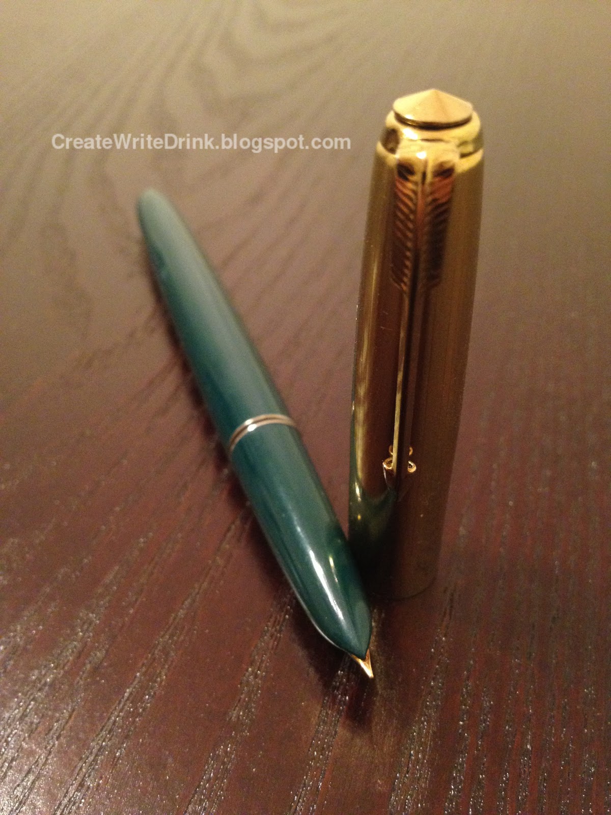
First Impressions (9)
This is how a demonstrator should look! Allow me to back up a moment. The Artista Crystal comes in a very nice Monteverde box. This box, in turn, is within another Monteverde box - cardboard, this time, accompanied by warranty information and a small advertisement for Monteverde inks. The excellent packaging, alone, impresses me. As for the pen itself: it appears to be just the way a demonstrator should look. The non-translucent parts are a chrome/silver, but Monteverde tries to keep those to a minimum. Rolling the pen in my hand, I come across the deal-sealer: a transparent feed. If every demonstrator had, at the least, a translucent feed, I would be very happy. Sadly, very few do. The Pilot Penmanship demonstrator could be made ten times better through the inclusion of a transparent feed, rather than its translucent dark blue, but I digress. The Artista Crystal does not awe me, at first glance, but it makes me take notice, and it certainly holds my attention.


Appearance (10)
The rating, here, is actually 9.5 (for the sake of scoring, I round to the nearest whole number).
I really want to be able to give this pen a full score in appearance. The color options are wonderful (all demonstrators). The cap jewel, clip, and accent band are the only metal parts on the cap, so kudos to Monteverde for not making the mistake, as Lamy did with their Safari demonstrator, of putting some silver shielding inside the cap, covering it halfway to the end. The cap by itself is an excellently designed piece. Uncapped, one can see that the pen has some taper to it on both ends. The entire body piece is translucent with no metal accents (more kudos). The feed, oh, the feed. It is transparent. Thank you, wonderful Monteverde designer, for making the choice to use a clear feed. It looks fabulous. My one, solitary complaint is, unfortunately, a large part of the design: the metal/chrome grip. Yes, it matches the clip and the cap jewel, but, I personally feel that a translucent grip would have suited this demonstrator, more. That said, the next best choice probably was, as it is.


Design/Size/Weight (9)
From the moment I took this pen from its box, I could feel the quality in the design and weight distribution. This pen would be an amazing daily writer for someone. It just so happens that the someone of whom I spoke is not me for reasons I shall soon mention. Nib to barrel... The cap design is solid, really solid. Despite not having any internal metal structure (thankfully, for its looks), the cap has some heft to it, and the plastic of which the pen is made is thick and does not feel brittle. The designers did balance the thickness with not making the pen look or feel chunky. The solid metal cap jewel is a nice touch and contributes a lot to the cap’s weight (and the posting balance, which I shall discuss momentarily). The nib length is a good size, protruding slightly over three-quarters of an inch from the section. It is the section, however, where the problems for me begin. Simply put, it is short, and my hands are large. When writing for an extended period of time, my fingers feel, as though they are being cramped together at the end of the pen. Even with my fingers as far forward on the section, as possible, I am still gripping the barrel threads at the same time. I can still write with no problem, but it is not the most comfortable writing experience. Someone with smaller hands would have less of an issue, I think. The barrel threads, themselves, are of a good depth. The cap screws on and off solidly with a single turn and no wobble at all. The barrel, constructed entirely of the same hard plastic as the cap, feels sturdy and substantial in my grip. Looking at the end of the barrel, I notice something strange. It appears that one portion of the wall is thicker than the opposing portion by twice as much. It does not feel, as though the structural integrity has been compromised, but I find it to be an odd flaw. As I mentioned previously, the cap jewel contributes significantly to the weight of the cap. While posted, the cap thus gives the pen a distinct feeling of being back-heavy. For me, this is not a deal-breaker, as I rarely post my pen caps. Overall, Monteverde appears to have put quite a bit of thought into the design of this pen.

The strange difference in wall thickness


Filling System (9)
This Monteverde is equipped with a very standard, yet highly functional cartridge converter assembly. The barrel is long enough to accomodate the storage of a second, short standard international cartridge, though long cartridges may also be used. The included converter is a good, solid construction.


Nib (7)
Out of the box, I am not impressed by this nib. It never had writing issues, per se, but it has some struggles. While I am sure that the feed played a role, here, this pen wrote fairly dry with all of the inks that I put through it. With Parker Quink Black, which I am using to write this review, I feel, as though I am having to press unnecessarily hard to get decent ink flow.
The smoothness of the nib is nothing spectacular, either. With a toothiness that verges on what I would call scratchy, it was not the most flowing writing experience I have ever had. When I did find the nib’s sweet spot, it was a high angle, such that it felt unnatural to hold the pen, thus.
The medium nib is fairly narrow, as a point of observation.


Cost and Value (8)
This is difficult. I feel that I should disclaim or qualify many of my statements. However, factually, the pen has good looks, solid construction, a filling mechanism well-suited to a fountain pen user of any experience level, and a cost of $36 US (retail). Additionally, the nib is not the best, as compared to some high end starter pens (I will avoid terming this pen, as such, but my thoughts here stray to the Lamy Safari and Pilot Metropolitan), nor are there other options, than the medium nib width. To those, who are looking for a beautiful demonstrator (either as a starter pen or a pen that will not break the budget), look no further. But, if you are searching for a customizable pen that offers many nib options, the Artista Crystal might not be the answer. The part to be disclaimed is, for me, this pen does not hold the same value, as one that fits my hand and provides me with a better writing experience. For that, Monteverde, I am sorry. I had such high hopes for your pen and I to become good friends.


Conclusion (9)
8.6 is the actual score.
This pen is going to make a wonderful daily writer for someone. They may even choose to modify the nib, making it narrower, smoother, and more consistent. It is hard to make blanket statements about hand sizes and comfort level, as personal grip preference and writing style play important roles. Thus, while I do not feel that I can recommend this pen for folks with large hands, it may suit some of them. Monteverde has certainly put a great deal of effort into this pen and its design, and for that they should be applauded.

Attempting to show the transparent feed


A big thanks goes out to Brian and Lisa Anderson for making this review and contest possible! Be sure to visit them at their fabulous online pen shop, AndersonPens.net. The Monteverde Artista Crystal can be purchased from their shop, here.

Now comes the fun part! You have the chance to call this pen your own, along with one of the stunning Anderson Pens Proper Pads. All that you have to do is leave a comment below, telling us what your favorite demonstrator fountain pen is and then use the handy Rafflecopter form to confirm your entry. (You must use a valid email address to enter.) This contest is open to my domestic and international readers!

Need to know what a demonstrator pen is? Have a quick look at the Wikipedia article! You can earn an extra entry by tweeting about this giveaway.

a Rafflecopter giveaway

As always, please feel free to post any questions or comments that you might have, below!

Tuesday, March 26, 2013

Tea Review Tuesday - A Review of Daude's Xaouen Green Tea

A Review of Daude's Xaouen Green Tea

My first reaction to this tea was that it smells very sweet and a lot like potpouri! The scent of roses blends nicely with the fruity smell of mango and the sharp scent of jasmine.

After four minutes of steeping, the previously strong aroma really mellows out to a pleasing blend of primarily jasmine and mango scents. My first sip seemed to be entirely roses, followed by hints of tropical fruit and some jasmine. Quite pleasant, if not a bit much in the way of flowers. Taking a bigger swallow, a myriad of flowers and the mango taste flooded my mouth, though everything seemed to be tinged with the flavor of roses. There really is not much taste of rooibos in this tea, as it is overwhelmed by all the other tastes...and it really is okay. I see no problem with that (excepting that one of those tastes is sadly not rooibos).

To be quite honest, I cannot say this is something that would have caught my eye and held my attention if I had seen it in a tea shop. Perhaps it would have required a second glance at the ingredients and at the tea itself, as it is very attractive, and unique looking, both in the dry leaf and in the list of ingredients. It is tasty, the flavor is quite pleasant, and I believe it is a tea that some will very much enjoy. As for myself, I give it a 75/100 on my personal enjoyment scale.


Daude's Xaouen can be purchased from their website, here.
Photo credit to Daude.
This review was unsolicited and uncompensated.

Monday, March 25, 2013

A Review of the Wing Sung 233 Fountain Pen


A Review of the Wing Sung 233 Fountain Pen


First Impressions (6)
I have mentioned “simplistic” and “understated” as descriptors for fountain pens in the past, yet I think that the Wing Sung 233 takes these words to a whole new level. This was at least my impression upon first viewing the pen, while it was capped. From the plain, unadorned body to the likewise-unadorned cap, both of which lack much for intriguing detail, one could easily overlook a pen like this in favor of more eye-catching choices.
Yet, I know that Wing Sung is a sub-brand of the Shanghai Hero Pen Company, whose simple designs and inexpensive pens are daily-use writing instruments for many. There must be a factor that contributes quite positively to the design.


Appearance (7)
As mentioned above, the looks of this pen are nothing at which to necessarily get excited. Capped, the plain, black body provides a nice contrast to the brushed chrome cap with its faintly engraved lines, running its length. The clip is simple and ridged, yet it does not impress me that it is so tight, as to constantly slip toward one side or the other of the cap. Based on the shape of the clip’s side panels, it does not look as though it should be as tight as it is. Faintly engraved at the base of the cap are the words “Wing Sung,” “233,” and some Chinese characters that I have begun to recognize as being present on nearly all pens that are made by the Shanghai Hero Pen Company. On this pen in particular, they are are engraved at the base of the cap, on the metal cover for the aerometric sac, and on the nib.
Removing the cap, I both like what I see and dislike it at the same time. Starting at the nib... The nib is of a wrap-around style, which looks fantastic and very unique, but the makers chose to go with a fake-looking gold color for the nib, which clashes with the chrome of the section band and the cap. Additionally, they stamped “Made in China” across the top of the nib under the Chinese characters, which just seems tacky. Behind the nib is the smooth grip, which is the same color as the body, followed by a chrome ring, an amber ink window, and the body itself. The amber window is nice, but I do wish that they had used the same color metal over the whole pen.


Design/Size/Weight (6)
I already mentioned the wrap-around nib as being a nice aspect of this pen, but there are far more design features, which I feel were good choices on the part of the Shanghai Hero Pen Company. First is the slight tapering curve in the grip. This taper curves in as it narrows, rather than out, as some tapers do. Thus, despite the smooth grip section, I never felt as though my fingers were slipping down toward the nib. The decision to add an ink window to the  section above the grip is strong in theory, providing the user with a good view to the ink supply; but the amber color, the narrow width, and the internal ribbing on the window distort the view in this pen, greatly. The length of the body is just long enough for my large hands, so as to still be comfortable. Since the cap is relatively light, posting it does not affect the balance of the pen. In fact, because posting it does not add a great deal of length (no more than an inch to an inch and a half), the 233 is one of the more comfortable pens that I have used, posted. Replacing it, the cap snaps on to the body, hard, and has no danger of accidentally coming off, while capped. Around the area where the ink window and the grip section end and the body of the pen begins, there is a bit of a step on account of the body being of a slightly larger girth than the ink window portion of the section.


Nib (5)
The nib certainly has a cool shape...too bad the performance does not match it. Honestly, it is nothing special. While not a rough scratchiness, the scratchy aspect is present no matter what direction the pen is writing. While the nib does not chew on the paper, the writing experience is far from gliding, though I am sure that some at-home nib touch-ups would lead to a slightly more enjoyable usage.


Filling System (6)
I find it too bad that Wing Sung (and thereby the Shanghai Hero Pen Company) insists on using aerometric filling systems in so many of its pens. These mechanisms can be very hit and miss for quality, as well as often frustrating to clean. I appreciate that some of the Hero pens have a removable aerometric mechanism, which makes them much easier to clean and dry. This Wing Sung, however, is not one of those, and the filling bar on this particular pen proved very finicky to fully depress, while loading the pen with ink.


Cost and Value (7)
Despite the shortcomings of this pen, the $3 US price tag is hard to beat...unless you find another pen made by Hero that has nicer features, performs better, and is better designed. Doing so does not prove difficult, certainly, yet few enough have the wrap-around nib. I found that this pen proved to be decent for some daily note-scratching and adding appointments to a planner.


Conclusion (6)
Unless you really like the looks or you collect pens from the Shanghai Hero Pen Company, I recommend you keep looking, rather than choosing this pen. The Wing Sung 233 is not a bad pen by any means, but I do not think it will be winning awards or popularity contests any time in the near future.


Feel free to post any questions or comments that you might have, below!

This post was unsolicited and uncompensated.

Saturday, March 23, 2013

The Financial Analysis of Fountain Pen Ink

Before we get into the topic at hand, I would like to make a disclaimer that this article does not contain any methodology or suggestions for acquiring pre-tax write-offs on the purchase of fountain pen ink. For inquiries of this kind, please direct your questions to an accountant, preferably one who loves fountain pens.

Through a conversation with a good friend, I came to realize how infrequently I have heard a case made for the use of bottled ink over ink cartridges. Certainly, the biggest pro on the side of cartridges is their ease of use, convenience (both of changing and of carrying), and lack of mess (or much of one at least!)

Discussions of environmental impact and waste could be argued back and forth from how the usage of plastic for cartridges (that are thrown away, when empty) matches to the large glass or plastic ink bottles and their corresponding boxes or other packaging. Likewise, using the argument for a greater variety of colors and brand options in bottled ink, while a valid point, cannot be applied to all people. Some fountain pen (or refillable rollerball, etc.) users, as shocking as this may sound to some of us, actually prefer to just use one or two colors by one or two brands, whose ink is probably available in both cartridges and bottles. As I have not yet encountered a fountain pen that could not take bottled ink, so long as it could take cartridges, I shall assume that this does not pose a problem.


What I would like to propose is a case for bottled ink, based on cost. This will not take into account any of those other conditions and will make the assumptions that the brand in question offers the same color in cartridges and bottled ink and that the cartridges are the short, standard international version, holding approximately 0.5 mL of ink. (A standard international converter is also assumed to hold approximately 0.5 mL of ink.)

The cost breakdown, using Montblanc's Oyster Grey ink stands as follows:

One box of cartridges
= 8 cartridges @ 0.5 mL / cartridge
= 4 mL / box @ $4 / box
= $0.50 / cartridge or converter fill (0.5 mL)

One bottle of ink
= 60 mL / bottle @ $17 / bottle
= $0.14 / cartridge or converter fill (0.5 mL)

When viewed by the half milliliter fills, these cents may seem slightly trivial; however, to purchase enough cartridges to equate to the same amount of ink as in the $17 bottle, one would need to buy $60 worth of cartridges! The cost effectiveness is worth the extra initial investment in my mind.


Of course, there are exceptions and other reasons for not buying bottled ink. For example, in the specific case of Montblanc, ink samples are not readily available. Thus, one may want to purchase a $4 box of cartridges to test before actually paying for a full bottle, and this is perfectly logical. However, I urge you to take a look the cost effectiveness of your ink purchases! The savings may surprise you.


(Side note for interested parties: all of Montblanc's inks are priced the same, if they are purchased from a Montblanc boutique in the United States. All boxes of eight cartridges are $4 and all sixty milliliter bottles of ink are $17, regardless of the color in both cases.)


This post was unsolicited and uncompensated. Please feel free to post any questions or comments, below.

Friday, March 22, 2013

Anti-decanting in Action!

Not long ago, I spoke about the freshness of tea and provided some tips by which one could keep their teas tasting better for a longer period of time. In that article, I mentioned the downfalls of buying in bulk, followed by telling of the implementation of "anti-decanting" in my tea collection.

"Anti-decanting" is a process by which one takes a portion of tea from a larger container and stores it in a smaller container for regular use. So named for mimicking the way in which wine is decanted, "anti-decanting" actually serves the opposite purpose of decanting wine - it keeps the tea away from air, as much as possible, rather than exposing it.


For me, small bags with tight seals, as well as small Tupperware containers, make excellent "anti-decanters." What kinds of storage do you use?

As always, comments or questions are more than welcome. Happy "anti-decanting" and tea drinking!

Thursday, March 21, 2013

Stained Fingers on Thursday - A Review of Noodler's Blue-black Ink

This ink is dark. It is really dark. I am not sure that I can express how dark it is. I need to try it in the driest pen that I have, which still has variation, like a Pilot Plumix, just to see how the ink behaves.
In the Baoer Skywalker, there was a bit more color variation; however, this variation was really only visible when using the ink and pen lightly on the paper. Faint hints of blue could be seen in some of the thinner strokes. 


This review was scanned at 600dpi on an HP Deskjet F4200.
Note: Because these scans are done with a light emitting printer, actual colors will, more likely than not, be slightly darker than they may appear, here. The colors shown, here, are probably a bit more reminiscent of what the ink would be like under a bright light or if it were held up and viewed with a light behind it.

Tuesday, March 19, 2013

Tea Review Tuesday - A Review of TeaFrog's Pu'erh Mini Tuocha

A Review of TeaFrog's Pu'erh Mini Tuocha

With the first steeping of this unique tea, I could tell this was going to be an awesome pu'erh. Unlike other mini tuocha that I have tried, this one did not make me wait one, or even two infusions, to reveal to me its delicious earthy tones. The first steeping produced a light brown liquor with a light earthy aroma that also smelled faintly of tobacco. The flavor was rich, even with this first infusion, hinting at even stronger flavors to come. The smoky, earthy liquor was mellow from the beginning, sliding smoothly across the tongue. I was really impressed that this was only the first infusion and yet this tea was giving so much.
The second infusion steeped darker and stronger, smelling woody in addition to earthy. The taste became strong while still not overwhelming. Something of note which I found interesting was the fact that while there is much flavor upon first sipping the tea, very little aftertaste remains behind. The earthy rich flavor of this tea very nearly drove me to distraction as I contemplated it and sat thinking, completely forgetting for a few minutes about the review I was writing.
During infusion three, things changed. The tea went from being the color of milk chocolate to being a dark brown, akin to dark chocolate. The aromas of the tea grew in intensity, and the flavors increased in strength, lending large amounts of dark, woody flavor to the tea. These flavors reach out and grab ones attention, seeming to strive toward drawing the consciousness into them. Mmm, delicious.
Infusion number four held a certain small degree of bitterness while continuing to carry those flavors from previous infusions. I stopped after four infusions, quite pleased with how this tea had turned out.
I would give this tea an 87/100 on my personal enjoyment scale.


TeaFrog's Pu'erh Mini Tuocha can be purchased from their website, here.
Photo credit to TeaFrog.
This review was unsolicited and uncompensated.

Sunday, March 17, 2013

Inked for the Week of March 17, 2013

This evening, I had the random urging to write out a page of the pens that I have currently inked. Then, thinking to post that on this blog, I realized that some of you might be interested in the pens themselves. Thus, I present the writing AND the instruments.


Thursday, March 14, 2013

Stained Fingers on Thursday - A Review of Diamine Imperial Purple Ink

I had purchased a number of purple ink samples with the intentions of trying to find a vibrant purple ink for special usage. It needed to be more on the blue end of the purple spectrum, rather than the red/pink end. Diamine Imperial Purple was certainly a winner, in those regards.


This review was scanned at 600dpi on an HP Officejet 6500 E710n-z.
Note: Because these scans are done with a light emitting printer, actual colors will, more likely than not, be slightly darker than they may appear, here. The colors shown, here, are probably a bit more reminiscent of what the ink would be like under a bright light or if it were held up and viewed with a light behind it.

A Review of the Hero 616 Jumbo Fountain Pen


A Review of the Hero 616 Jumbo Fountain Pen


First Impressions (7)
At first glance, the 616 Jumbo appears plain, understated, and perhaps a bit fat. The girth of the pen does not detract from its looks - it is merely noticeable in comparison to other Hero pens (and thus - the “Jumbo” title). The smooth curves of the pen’s body are quite attractive, yet very understated, as I mentioned about the whole pen.

Appearance (7)
The cap of the 616 Jumbo has subtle engraved striping running its length (though this is not so noticeable on my pen, now, on account of wear and age). While the clip may appear to be slightly thin, I find it to be stiff with only the slightest spring. This cap will not be breaking easily under daily use on a shirt pocket, notebook, etc. The cap is entirely of the same gold-/bronze-colored material, including the cap jewel. I feel as though it would have looked much nicer, if the cap jewel was flush with the clip band and the rest of the cap. It is quite solidly affixed, yet it looks, as though it is loose or about to come off.
The body of the pen itself is very plain. In fact, because of the hooded nib, the only thing to break up the (dare I say) “monotony” of the plain plastic body is the partially transparent band between the section and the rest of the barrel. I found it very interesting that a narrow, clear band, framed by two metal bands, would be used here. It is mostly too narrow to get a good feel for the present ink level by sight. All of that being said, it is not bad looking. The body of this pen truly is very simple, and the cap provides most of the character. There is very little else on which to speak for appearance. Plain and simple with a touch of style.

The narrow, clear band

Design/Size/Weight (7)
With a plastic barrel, plastic section, plastic/rubber filling mechanism, and only thin metal for the cap, nib, and sac cover, this pen is really light weight. I personally do not prefer the “Jumbo”, as I find the large taper of the grip to be awkward and not a pleasant writing experience. To counteract the taper, I feel, as though I have to hold the pen too far toward the back of the grip section. However, the length of the pen is good for hands of any size. Does the plastic feel a bit cheap? Sure it does, but it is a cheap pen. The major downside is the grip, which might not be an issue for some people.


Nib (5)
I am certain that Hero does not perform much quality control on the nibs of their cheaper pens. As this is definitely one of those cheaper pens, I do not expect much out of the nib. However, the nib on this 616 is definitely on the low-end of the quality spectrum that I have experienced with Hero. The nib exhibits a great deal of scratchiness, rough edges, and an odd slant to the left side. (Imagine an oblique nib merged with a European extra-fine round nib.) I doubt this low quality is present in all 616 Jumbo nibs, though the possibility exists. Thus, the low score certainly does not reflect my opinion of all Hero nibs. This one is completely usable, too - just not terribly pleasant.


Filling System (6)
Ah, the aerometric filler. Why, Hero, why? Admittedly, I can think of two reasons (and one is more valid than the other, though I shall leave to the imagination which is which). 1) Sacs and the metal covers for them are cheap. 2) It further imitates the Parker 51. In my personal opinion, aerometric filling systems are...okay. I do not particularly prefer them. Though they can be more useful than cartridges (certainly more cost effective), cleaning them fully can be a bit of a chore. The filler on this 616 Jumbo is very standard. Give it a squeeze, wait a second, give it another squeeze, wait another second, and repeat a few times. For cleaning, I would much prefer if the aerometric filling mechanism was removable for the sake of being able to better flush it. (It is removable on some Hero pens, such as the Hero 59.)

Cost and Value (9)
The cost and value are where a great majority of Hero pens shine. (It should be noted that there are Hero pens that retail for more than a Lamy Safari, though they shall have their reviews in due time.) $3 (USD) is all for which this pen retails. If purchased in China, I am certain that the cost would be even less. Yet, for $3, this pen is worth it, so long as its looks and filling mechanism are not issues for the potential buyer. While it might not be the best pen for a beginner, it is certainly sturdier than a Platinum Preppy.


Conclusion (7)
The comparison between most Hero pens and Platinum Preppies is probably one that I will make again in future reviews of Hero pens. Cost-wise, the quality and reliability of the Hero pen shines, if such an inexpensive pen can truly “shine.” For me, the Hero 616 Jumbo certainly has its downfalls, but the simplicity and reliability keeps the user experience a worthwhile one. For a majority of fountain pen users, I recommend looking to other pens from the Shanghai Hero Pen Company.

This review was unsolicited and uncompensated.

Wednesday, March 13, 2013

Three Tips to Help Improve Your Penmanship

On this fabulous Wednesday morning, I bring to you, the readers of this blog, a special feature: the following guest post, written in full by Alice Jenkins. Read on, as she details her Three Tips to Help Improve Your Penmanship. Please enjoy, and I invite you to leave comments or questions below.


Three Tips to Help Improve Your Penmanship
Do you love pens, but hate writing because your handwriting looks like the illegible scrawl of a third grader? Have you always wanted to write using a fountain pen or a dip pen, but inevitably find your arms coated in ink and your paper covered in ink blotches? Here are a few tips to help you improve your handwriting to develop the aesthetically pleasing hand of your grandparents (my grandparents anyway, I don’t know about yours…).

Don’t Use Your Fingers
It’s called handwriting for a reason. Your fingers grasp the pen and hold it in position, but your forearm and shoulder are going to be required to actually write smoothly. Simply pick up your hand off of the paper and you’ll automatically find yourself writing very differently, that’s what you want to learn. At first it’ll look like an awful scrawl because you’re not used to it. Once you’re accustomed to having your entire arm moving while you write instead of just your fingers you can write with your hand resting on the paper again, just be sure that your arm is still engaged in the writing process.
The muscles you want to use are mainly in your shoulder and back. If you’ve ever watched an old kung fu movie you’ll almost certainly have seen a scene where the young Chinese warrior is required to learn to write. If you were paying attention you’d notice that they hold their brush vertically with a stiff wrist and their arms lifted off the paper (they’re using a brush, so it’s a bit different, but bear with me). If you were ever to learn to write Chinese using traditional techniques you’d find that you’d be using exactly the same muscle groups as you would be when handwriting with a pen.

Get the Right Angle
As we just mentioned, we’re not writing Chinese; ideally you’d hold your pen at a 45 degree angle to your writing surface. This isn’t because it’s better for your muscle control, but rather because it helps to keep the flow of ink from your pen running smoothly if you’re using any kind of pen with a proper nib. Holding the pen vertically means that increased pressure won’t bend the tines of the nib properly, possibly damaging it or your paper. You don’t need to hold it at exactly 45 degrees, it’s more important to hold the pen comfortably than it is to get the angle perfect, because if your hand is cramped you’ll run into a whole new set of problems. The important thing to remember is that holding the pen at a shallower angle will give you better control over the tension on your nib and with it more control over the thickness of your lines.

How to Practice
My favorite practice phrase is the old classic “The quick brown fox jumps over the lazy dog” because it contains all the letters of the alphabet, so you get to practice everything at once. Sit down and write it ten times (or a hundred if you feel like it), and then come back tomorrow and do it again (etc…). Don’t overdo it at first, because you’ll notice very quickly that you’re training new muscles by just how sore your shoulder and arm will get. Good luck!


Alice Jenkins is a writer, graphic designer and marketer. When Alice isn't nitpicking her own logo designs, she writes about social media, business branding and design. Alice writes for PensXpress, a business that specializes in personalized, imprinted pens. She can be contacted via her Google+ page.

Tuesday, March 12, 2013

Tea Review Tuesday - A Review of Mark T. Wendell Tea Company's Pu'erh Tuocha

A Review of Mark T. Wendell Tea Company's Pu'erh Tuocha

To begin this review, I have to say that I am a bit of a sucker for pu'erh sold in bird's nest form, just because I think it looks really cool. However, I will attempt to not let this affect the bias of my review. Soooo, without further ado...
The dry tuocha smelled dark, dark and rich. Its very earthy scent had a touch of spicy notes to it as well. Wet, it had spicy and tobacco tones about it.
I chose to infuse this using multiple short infusions of about 30 seconds each.
First infusion: The liquor was still very bright and clear, a light brown in color. It smelled faintly of the dry tuocha. The taste is very light, and I wonder if 30 seconds is not long enough. It certainly does taste earthy though. It is not as spicy as the smell led me to believe.
Second infusion: This time, the brown liquor deepened and darkened in color, while maintaining its brightness. The scent is now very earthy, with almost a bit of fishy smell to it. Mmm, the taste has deepened. Full-bodied, the liquor tastes earthy and mellow. It goes down smooth, as though it barely brushes the tongue and throat.
Third infusion: The color of the tea is now a deep brown, nearing dark chocolate in shade. The aroma has not changed much, but the flavor is much stronger and feels more mature. Very delicious at this point. I am quite enjoying this tea and I wonder how long this tuocha will last.
Fourth infusion: This cup was just as enjoyable as the third and had the same strength and characteristics. It seems as though this tea could certainly continue with more infusions. When I have more time, perhaps I will give one of these tuocha a test of how long it can last.
I loved being able to try this tea as it continued to grow and mature in taste and aroma. I truly cannot wait to drink it again. I rate it an 85/100 on my personal enjoyment scale!


Mark T. Wendell Tea Company's Pu-erh Tuocha can be purchased from their website, here.
Photo credit to Mark T. Wendell Tea Company.
This review was unsolicited and uncompensated.

Monday, March 11, 2013

A Special Tea Review and Comparison - Twining's of London's Lady Grey Black Tea


 It is not yet Tuesday, but today, I felt that a special tea review was in order. I recently received a tin of Twining's of London's Lady Grey in loose leaf form. Though I do love this tea, I had previously only been drinking it in bagged form, as the grocery stores to which I have gone only carry the teabags. By no means was this a bad thing, as I thoroughly enjoyed the bagged version. However, when the opportunity came for trying Lady Grey loose, I jumped at the chance.

Normally, I do not involve cost in my reviews. In fact, I will not factor it into the final review estimation - only provide it for the sake of interest. From the Twining's of London website, a box of 20 Lady Grey teabags may be purchased for $2.99. At my local Target, this price was much higher at $5.59. The 100g tin of Lady Grey costs $4.49 from the Twining's website. In an estimation of the number of cups made from 100g of black tea with 1.25 tsp, the numbers came to about forty cups. Assuming that no tea is reused and an average (1 teabag/ or 1.25 tsp/cup) amount of tea is used, the loose leaf provides a more cost-effective option, whether it is from Twining's own website or another retailer. Note that this does not take resteeping into account, yet from my own experience resteeping would be more successful with loose leaf than bagged tea. As for the tea itself...

I attempted to make these two cups of tea as similar as possible. I used just over a cup of freshly boiled water in each. In one, a single teabag. In the other, slightly more than a teaspoon of loose leaf. The steeping time for both was about four minutes. After that time, I removed both teabag and loose leaf and set to sniffing.

The aroma of the bagged cup carries far more of the lemon-y citrus scent. To me, the cup made from loose leaf smells richer and deeper - probably an indication that the flavor will be much stronger. The tea being used as a base makes itself known in the aromas of both cups, though the bagged tea seems to wrap the scent of the tea itself in the citrus additions. In the loose leaf cup, it smells like the tea and the additions stand together, hand in hand. One is no more vibrant that the other

The first sip of each tea immediately strikes me with difference. These differences could be promoted by a number of factors, such as the use of differing amounts of tea, the openness of the leaves to the water, the size of the leaves, their ability to expand within the water, etc. It would seem that, despite both teas carrying approximately the same directions for steeping, the outcomes can be radically different. The bagged cup has a very smooth mouthfeel with an aromatic flavor that seems to slide over the tongue, leaving hints of the black tea base. On the other hand, the cup made with loose leaf feels less smooth. It is not rough by any means, but the strength is somewhat higher, and the increased boldness and presence of the tea itself give the brewed tea a more "full" feeling. (That is not to say that the bagged Lady Grey tastes weak, of course.)

Having consumed Twining's Lady Grey in bagged form for some time now, I cannot say that I was expecting the loose leaf tea to be so different. Yet the commonalities lay with the spirit and feeling of this tea. Mildly flavored with orange and lemon, Lady Grey tastes calm, the flavors still reminiscent of its stronger Earl Grey sibling. If your preference is toward light black teas, I can only recommend this tea, even further. On my personal enjoyment scale, I rate it an 86/100.

Saturday, March 9, 2013

A Word on the Freshness of Tea

An aspect of tea that goes often overlooked lies in the freshness. Will the tea that you have kept in a ziploc bag in the back of your cupboard for four years still taste good, today? Maybe...but I can almost guarantee that the flavor will have diminished in body and quality from what it once was. Excepting certain teas that are meant to be aged (in a proper manner), most tea tastes far better when it is fresh. I have found that the three other factors that will affect the freshness of tea are light, extreme temperatures, and air.
  1. Age...Much like food, tea can lose its freshness over time, even without the other factors.
  2. Light...Keep your tea stored out of direct sunlight and artificial light. The UV light can break down the tea, and florescent lights can also have a negative effect.
  3. Temperature...I have encountered a number of places that recommend storing tea in the refrigerator; however, this only really works with greens and very lightly oxidized teas, and, even then, I have found that this changes the flavor of the tea. 
  4. Air...Your food does not benefit from extended storage and exposure to oxygen, so why should your tea? Additionally, aromas in the air can affect the smell and taste of your tea.
Fear not for your tea! There are certainly things that can be done to combat the above freshness-killers. Here are a few corresponding (to the above list) tips that I have implemented in my own tea collection
  1. Age...Only buy an amount of tea that you will consume within a few months. This will assure optimum freshness. Sometimes, the freshest-by date on a tin of tea will only be valid so long as you do not break the vacuum seal. (The exception to this age rule is pu'erh, the storage of which will not be addressed in this post.)
  2. Light...Use opaque containers to store your tea. Alternately (or additionally), store your tea in cupboards, drawers, etc. which would allow for the use of transparent containers, if such is your desire.
  3. Temperature...In the refrigerator or freezer is not the best place for your tea (in my opinion). Near a stove/oven or next to a dishwasher is not ideal, either. I keep my tea in cupboards away from this large appliances. 
  4. Air...Use air-tight containers for the storage of your tea. (Again, this does not entirely apply to pu'erh storage.) Containers (such as bags) inside larger containers (such as Tupperware)? Sure! So that your tea does not pick up the aromas of food or other teas, I do not recommend storing tea near food, nor do I recommend storing very aromatic teas in bags with other tea. I have had a weakly aromatic tea pick up the smell of a much more strongly-scented tea by both teas being stored in Ziploc bags next to each other for a period of time. My final word on this is to avoid exposing your tea to air, as much as possible. The following is an example from my personal tea collection:
 Rishi's Peach Blossom white tea has remained one of my favorite summertime teas for many years. This could potentially be saying something, considering that I am the same one, whose taste in black teas has varied over the years from strictly unflavored to almost entirely flavored (fruit, chocolate, crazy froo froo blends) to, now, mostly enjoying aromatics (e.g. Earl Grey, Lady Grey, etc.) and lighter black teas, such as Darjeelings. As such, I find it financially wise to purchase Peach Blossom white in bulk, pre-summer.
However, it would not be wise for me to open this large bag, every time I wanted to get a few teaspoons of leaf, especially if I am making it several times per day. The amount of oxygen to which this tea would get exposed could have quite negative affects on the delicate flavor and aroma. Aside from making certain that this bag is closed with as much of the air removed as possible, I use a method that I call "anti-decanting." (You heard it, here, first, folks). At its most basic, decanting involves moving a liquid from one container to another. With wine, decanting is often perform by pouring wine from an enclosed bottle to a more open decanter for the purpose of exposing the liquid to air and allowing the wine to breathe. While we are not dealing with liquid, the theory here is the same, simply reversed in regard to the air exposure. I take a portion of the tea from the larger container and put it into a small bag (or bags), which are stored with the same positive conditions as listed in the middle of the post. Thus, I am reduced from opening the large bag several times a day to a couple of times per week, depending upon the frequency with which I am drinking the tea.


Hopefully, this post has provided you with useful tips for keeping your tea tasting and smelling better for a longer period of time! Feel free to post comments or questions, below. Happy tea drinking!