Thursday, May 30, 2013

Stained Fingers on Thursday - A Review of Montblanc Toffee Brown Ink

Yup..."Foffee." It is now a thing. Having only two cartridges of this ink, I should have swapped them between more pens, but I did find that Montblanc Toffee Brown to be a very reliable ink. Really, reliable is the best description for it. Or maybe, I will just stick with "foffee..."


Edit 10/2/13: Re-scanned and added another pen.


This scan was done on an HP Deskjet F4280 at 600dpi.
Note: Because these scans are done with a light emitting printer, actual colors will, more likely than not, be slightly darker than they may appear, here. The colors shown, here, are probably a bit more reminiscent of what the ink would be like under a bright light or if it were held up and viewed with a light behind it.

Tuesday, May 28, 2013

Tea Review Tuesday - A Review of TeaFrog's Love Rooibos

A Review of TeaFrog's Love Rooibos

The name makes me curious. Why would a tea be called Love? Aside from being TeaFrog's most popular rooibos blend (imply that people love it), I couldn't figure out the reason for the name. So, taking this initial assumption in hand, I had high hopes for this tea. Opening the package, I placed my nose at the opening and was assailed by a myriad of aromas, not the least of which smelled like the Fig Newton cookies I enjoyed as a child. It was different, yet delicious smelling.

The boiling of the water teases me as the scent of the dry rooibos wafts from the open teapot to my nose. Clock-watching begins as the time ticks toward zero...and toward tea time! Three teaspoons, two cups of water, and six minutes later I was ready to enjoy this aromatic treat. The package says to steep for 5-6 minutes, and I chose the upper end as I like my rooibos strong.

And strong it was! Wow, this tea brewed up a dark red, almost muddy complexioned. The ingredients are well balanced, as I can definitely smell the red rooibos in amongst all the other ingredients. It has almost a spicy aroma to it now. Taking my first (big) sip, the subtly fruity liquor, with a tinge of spice (possibly from the orange peel), flows quickly and easily over the tongue. The flavour is well balanced between the rooibos and the additions. This tea definitely leaves one eagerly wanting to take the next sip. While it seems to have a light mouthfeel, the tea leaves a strong aftertaste of the non-rooibos ingredients. It really is quite a delicious blend and seems to be a tea that one would enjoy on a cold day, as the other ingredients combine with the rooibos to create a brew that warms the body and mind. Sadly, more descriptive words fail me as I'm lost in the tasty flavour of this tea. I give it 75/100 on my personal enjoyment scale.


TeaFrog's Love Rooibos can be purchased from the TeaFrog website, here.
Photo credit to TeaFrog.com.
This review was unsolicited and uncompensated.

Saturday, May 25, 2013

Yet Another Writing Sample (YAWS) - Broad-edge Calligraphy

Not long ago, I discovered broad-edge lettering. This fabulous-looking calligraphy style has been around for a long, long time, and I wanted to share my first attempt at my own broad-edge hand, done last weekend.


Next step: work on uniformity of the letters.

If you are interested in resources for learning this fabulous calligraphy, I urge you to check out this great webpage from IAMPETH.

Thursday, May 23, 2013

Stained Fingers on Thursday - A Review of Platinum Blue-black Ink

I am really uncertain as to how I began two entirely separate review sheets for this ink, but, here you have it, two separate review pages of Platinum Blue-black ink! As hinted in the review, it is less teal than Diamine Blue-black. The comparison to a midnight blue came from remembering how Noodler's Midnight Blue looked, when it was thinly applied to the page. On the sheet, where I refer to "...they are both blue-blacks...", I believe it is the Diamine and the Platinum about which I am talking.


This scan was done on an HP Deskjet F4280 at 600dpi.
Note: Because these scans are done with a light emitting printer, actual colors will, more likely than not, be slightly darker than they may appear, here. The colors shown, here, are probably a bit more reminiscent of what the ink would be like under a bright light or if it were held up and viewed with a light behind it.

Tuesday, May 21, 2013

Tea Review Tuesday - A Review of TeaFrog's Tiramisu Rooibos

A Review of TeaFrog's Tiramisu Rooibos

Pre-steeping, my nose revels in the wonderful and delicious smells coming from the dry leaves. This tiramisu smells delicious, and it is strong enough that I can hardly detect the scent of the red rooibos underneath it.

After steeping, the aroma of rooibos has been brought to a more prominent place, but the tiramisu is not letting go of its grasp on the scent and the senses. The liquor has steeped a deep red colour, yet remains bright and clear. Eagerly, I lift the cup to my lips in anticipation...

Creamy! This tea has a very thick mouthfeel that actually starts out being a bit thin, but when the sweetness of the tea finally hits, it thickens considerably. The rooibos has come through beautifully, though it almost seems to have too much rooibos flavour (as compared to the tiramisu). The tiramisu does put forth a good showing, however. It boldly jumps out at the drinker, and lasts a while, settling in a delicious aftertaste. With each sip, I'm left wanting to take another sip and another...

I really enjoyed this tea, which is probably an understatement, considering how fast I went through the first cup. I gladly give this tea an 85 out of 100 on my personal enjoyment scale.

Time to go have another cup!


TeaFrog's Tiramisu can be purchased from the TeaFrog website, here.
Photo credit to TeaFrog.com.
This review was unsolicited and uncompensated.

Saturday, May 18, 2013

Yet Another Writing Sample (YAWS) - Montblanc Lavender Purple In Close-Up

In showing the richness of Montblanc's Lavender Purple ink to a friend, I captured this photo and really liked the lighting and the angle. Thus, I thought I would share it with all of you!


Enjoy!

Thursday, May 16, 2013

Stained Fingers on Thursday - A Review of Diamine Amaranth Ink

After acquiring a sample of this ink to try and testing out the color with a dip pen, I determined that, while I like the color well enough, it is not something that I could see myself using every day for writing. When I put it in a pen, I shall re-post the review with more thoughts. For now, enjoy the pretty shading! (Updated on May 19, 2013.)


This scan was done on an HP Deskjet F4280 at 600dpi.
Note: Because these scans are done with a light emitting printer, actual colors will, more likely than not, be slightly darker than they may appear, here. The colors shown, here, are probably a bit more reminiscent of what the ink would be like under a bright light or if it were held up and viewed with a light behind it.

Tuesday, May 14, 2013

Tea Review Tuesday - A Review of Lipton's Darjeeling

In some respects, I find it hard to believe that I am actually reviewing a tea that is sold by Lipton. Quite some time ago, when I was first starting to "get into" tea, I discovered quickly that Lipton bagged teas were far from quality, when compared with some other bagged tea offerings, as well as nearly every loose leaf tea. The contents of each tea bag tasted as though they were fannings, which are the leftover dust of broken tea leaves. Yet Lipton's bagged teas were so inexpensive that they became the go-to bagged tea for hotels, restaurants, convenience stores, etc. looking to offer a tea that was cheap.

In more recent years, with the rise in tea's popularity among the masses, Lipton has been striving to bolster the quality of their offerings, at least from the visible aspect. Switching to pyramid infusers for some of their "premium" lines, offering flavored black teas, actually delving into the areas of white tea and rooibos (albeit flavored on both counts), and expanding upon their herbal blends are all examples of their attempts. (The current obsession with flavoring teas is another story/blog post entirely...) Another try on their part is branching beyond the "black tea" label to special, regionalized offerings. Today's review will touch on their Darjeeling.

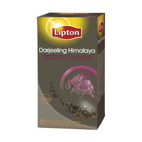
Traditionally, Darjeeling tea is sourced from a specific region in India, but the packaging for this tea bag has no source information. Because it is one of their "premium" teas, the label is at least a bit fancier than their generic black tea or even their Yellow Label tea. As three to five minutes of steep time in just-boiled water are recommended, I choose the low end (having already tried a cup of this, yesterday, that was steeped for four minutes and tasted entirely over-infused).

My thoughts from yesterday's cup had been along the lines of "I had been struck by a small ray of hope upon seeing that Lipton had been branching into what appeared to be slightly fancier teas. Unfortunately, after a very short steep, the produced cup was both bitter/astringent and not particularly flavorful." Having reduced the steep time for today's cup, I hoped that I could at least discern some better flavors with perhaps a touch more complexity.

No. No, no, and some more no. I wonder why this tea tastes like their generic black tea with a touch of darjeeling flavors? On one hand, I can at least tell that it is supposed to be darjeeling, so that very, very slightly satisfies my hope. On the other, massive hand...it tastes terrible. In fact, only the aftertaste is really darjeeling. The smell and initial flavors are rough and more reminiscent of an assam of low quality (sans the typical maltiness of an assam). Thankfully, this was a teabag that I picked up from the office and not something on which I spent money. The one redeeming factor about this tea is that worse teas do exist...but that is not saying much. On my personal enjoyment scale, I would rate this tea an 18/100.

Next week, I will review another one of these "premium" offerings from Lipton - the Kericho Estate Tea from Kenya.

Lipton's Darjeeling can be purchased from Amazon and a number of supermarkets. (However, I highly recommend Peet's Darjeeling as a readily available and far superior alternative.)
Photo credit to Amazon.
This review was unsolicited and uncompensated.

Saturday, May 11, 2013

Yet Another Writing Sample (YAWS) - Lots of Ink Samples and Scratch Sheets!

This weekend, I have something extra for you all...lots of scratch sheets! All of these came from a fountain pen meetup that I attended last weekend, where I spent a good hour testing and sampling inks with some fellow fountain pen-loving people. I shall provide commentary, as necessary, but most of these speak for themselves.


The Goulet Pens JoWo nib was great. For $15, it offers a great replacement nib for pens that take #6 nibs, such as the Noodler's Konrad, Noodler's Ahab, TWSBI Vac 700, and others. The Pelikan BB nib disappointed me, a little. I think I was expecting it to be more like the Montblanc BB nib. Instead, the Pelikan BB simply dumped a lot of ink on my page. "Overly wet" comes to mind, as a good description.


The Maruzen Athena inks are interesting. We believe they are made by Sailor, as the bottles are nearly the same, and the colors appear similar. Maruzen is the store that sells them, and the brand label is Athena.


The Chesterfield line of inks is actually manufactured by Diamine in the UK and bottled in the US as Chesterfield. The names are not 1:1, but some investigation will discover the parallels. For example, Diamine Blue-black ink is bottled as Chesterfield Night Sapphire. The prices are relatively about the same between the two, per milliliter.  I was intrigued by how silvery De Atramentis Silver Grey really looked, and the Montblanc Alfred Hitchcock ink was fabulous!


Wow, that Rohrer & Klinger ink was vibrant! I wish that the vibrancy showed more through the scan. Please forgive my misspelling of "Sailor Jentle..."


This scan was done on an HP Deskjet F4280 at 600dpi.
Note: Because these scans are done with a light emitting printer, actual colors will, more likely than not, be slightly darker than they may appear, here. The colors shown, here, are probably a bit more reminiscent of what the ink would be like under a bright light or if it were held up and viewed with a light behind it.

Thursday, May 9, 2013

Stained Fingers on Thursday - A Review of Noodler's Nightshade Ink

If ever there were such an ink shade/color as "purple-black," I think that this would qualify for that category. In fact, having now used this ink for several months, I think that it is my favorite dark purple ink. The color is dark enough that it can be used on a daily basis and not seem out of place, per se. (I use it for taking notes at work.)
For some reason, this ink also looks as though it would pair well with the Pilot Metropolitan in matte black, if you have the same pen color + ink color matching-OCD, as I sometimes do.


2014-03-27 EDIT: Updated with an additional pen.

This scan was done on an HP Deskjet F4280 at 600dpi.
Note: Because these scans are done with a light emitting printer, actual colors will, more likely than not, be slightly darker than they may appear, here. The colors shown, here, are probably a bit more reminiscent of what the ink would be like under a bright light or if it were held up and viewed with a light behind it.

Tuesday, May 7, 2013

Tea Review Tuesday - A Review of Mark T. Wendell Tea Company's Downy Pearl Jasmine Green Tea

A Review of Mark T. Wendell Tea Company's Downy Pearl Jasmine Green Tea

Well, these pearls certainly are downy...I felt one of the little balls of tea and it was soft and fuzzy. The jasmine smell is sharp and sweet in the dry leaf, and makes me wonder if the taste will be the same.

I used approximately two teaspoons of pearls, in two cups of water, for three minutes (give or take ten seconds, as I initially forgot to start my timer, oops). At the end of three minutes, the brew was very watery, so I let it sit for two minutes more. At this point, I would like to take a moment to say that while I enjoy the challenge of matching up just the right steeping time with just the right amount of leaf and water to make a delectable cup, I do wish that more companies would give what they believe the ideal steeping conditions to be, even if it is a rough estimate, since not all teas are created equally, and generalizing conditions does not always work out. Regardless, the extra two minutes seems to have helped immensely, as there is greater unfurl to the leaves and more color to the liquor.

The jasmine scent is just as sharp in the completed cup as it was in the dry leaf. And the taste....Wow...that is incredibly...mediocre. Thankfully, the sharpness of the jasmine has not come through in the taste of the liquor, yet everything about it is very average. The flavor is smooth, and light, and has a nice jasmine scent and taste, but, all in all, it just seems to be lacking something in a big way.

I enjoyed drinking it, but Jasmine Pearls are one of my favorites, so that could bias me a bit. I give it a 65 out of 100 on my personal enjoyment scale.


Mark T. Wendell Tea Company's Downy Pearl Jasmine is available from their website, here.
Photo credit to Mark T. Wendell Tea Company.
This review was unsolicited and uncompensated.

Saturday, May 4, 2013

Yet Another Writing Sample (YAWS) - Fountain Pen Meetup Scratch Sheet

Last weekend, I had the opportunity to go to a local fountain pen club meeting and try some new pens and new nib grinds. Here is my scratch sheet from that meetup.


Those Pendleton Pens' grinds were very, very intriguing and a lot of fun to try. The "angel wings" modification gives the nib a very unique look. (It also serves to assist in adding flex, I believe.)

Thursday, May 2, 2013

Stained Fingers on Thursday - A Review of Montblanc's Burgundy Red Ink

As a follow-up to last weekend's writing sample of Montblanc ink colors, I wanted to post this ink review, as soon as possible, so as to share this color with you. (I did not have a pen inked with Burgundy Red at the time of creating the writing sample.) With really wet pens, I quite like how rich this color is. As a burgundy ink, I find its greater tendency toward red more pleasing than burgundies, which tend toward pink, such as Noodler's Black Swan in Australian Roses.


Edit 10/2/2013: Re-scanned and added another pen.

This scan was done on an HP Deskjet F4280 at 600dpi.
Note: Because these scans are done with a light emitting printer, actual colors will, more likely than not, be slightly darker than they may appear, here. The colors shown, here, are probably a bit more reminiscent of what the ink would be like under a bright light or if it were held up and viewed with a light behind it.