Showing posts with label Crocodile. Show all posts

Friday, March 1, 2013

Of Swapped Parts and Line Comparisons

Hello all! I apologize for the lack of posts outside of our regularly scheduled content. They shall return soon, led by this one! The headquarters of Built from Ink and Tea has been moved to a new location, and the writing desk has at last been set up.

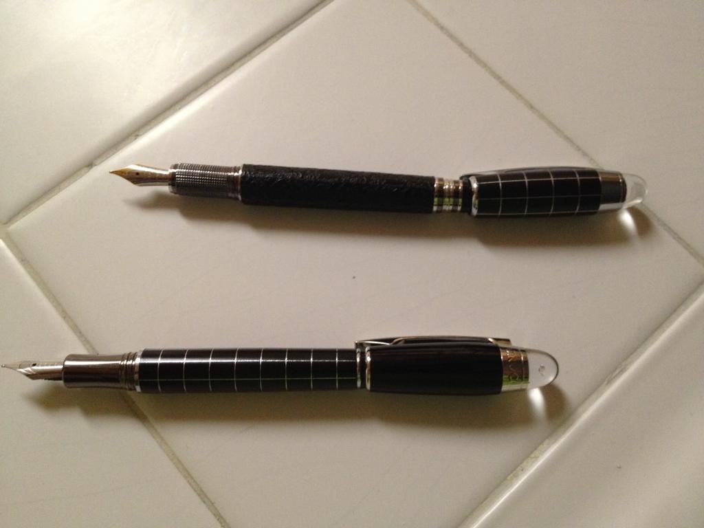
From reader questions, two separate topics have arisen. The first is comparing the Crocodile #232 with the Baoer Skywalker. In my review of the #232, I showed some pictures that had it, placed side by side with a Skywalker, but the similarities in size and details were not clear. (The review of the Skywalker can be found, here.) The question that followed was whether they were created in the same factory and merely re-branded, since both are obviously "tributes" to the Montblanc Starwalker. To this end, I tested this possibility by swapping around some parts, and here are the pictures of such efforts in comparison:

First test: Cap Swapping
Result: Success, though they were not as firmly capped as otherwise, it would work.

Second test: Cap Posting Swap
Result: Partial success, the Crocodile cap posted successfully on the back of the Baoer, but not vice versa. The threads in the Baoer cap do not work with the Crocodile posting-threads.

Third test: Section Swapping
Result: Failure. The threads, despite both being small, did _not_ match, and the sections could not be swapped. However, the nibs appear to be the same size.


On topic number two, allow me to reference my review of the Nemosine Singularity Demonstrator. The question, here, was actually a request - for a comparison of the line widths. To this end, I was more than happy to oblige, having an interest in this, myself. The results of my comparison are as such:


I had hoped to test one of the Knox K35 nibs and include it in the comparison. Specifically, I had a 1.1 stub that would have fit perfectly. Unfortunately, the curvature of nib and feed were such that the K35 nib did not fit the feed quite right, and the feed would need to be reshaped for it to work properly with this nib.
Update: I spoke with the fine folks at XFountainPens.com, who admitted that they had been mistaken in regard to the K35 nibs' compatibility with the Nemosine pen. The nib is the same size; however, the radial curvature is slightly different in the K35 nibs from the Nemosine nibs.

Finally, I hope that InCoWriMo went well for all of you. If you were unaware that International Correspondence Writing Month just ended, I highly recommend that you check out their website, located here.

'Tis time for more tea!

Saturday, December 15, 2012

A Review of the Crocodile #232 Black Leather Fountain Pen


First Impressions (10)
Wow, what an awesome-looking pen. When I had seen this pen online, I had been impressed. Now, though, I am even more so! If it were not for “Crocodile” printed around the cap and on the clip (and the crocodiles imprinted in the leather), this pen could certainly pass for a Montblanc Starwalker version at first glance.


Appearance (10)
While I am sure that the gem in the glass dome on the cap of this pen is made of cubic zirconia, it, nonetheless, gives this pen an air of luxury. Likewise, the leather-wrapped barrel presents a fancy air with a touch of ruggedness. This Crocodile bears a striking resemblance to the Baoer Skywalker (though, of course, they both pay tribute to the Montblanc Starwalker). The crocodiles that are imprinted in the leather are nearly unnoticeable, until one looks at them very close. In fact, it is not one single shape in the pattern, but a number of different crocodiles in repetition.


Design/Size/Weight (7)
I found that the gem in the glass dome was a bit off-center, which I expected in a pen of this price point. The barrel has moderate weight to it, which is barely increased by the cap, as the black body of the cap appears to be made of a plastic, just like the end of the barrel (a feature that I noted to be present in the end of the Baoer Skywalker barrels, as well). On the end of the barrel, the plastic is fine and seems solid, but, on the cap, the plastic feels cheap. Additionally, the metal clip feels thin and cheap, as though it might break with too much stretching. The cap can be posted upon the threads at the end of the barrel. The use of two metals of different shades with the section and accent bands works quite nicely with the leather and the black plastic. The textured grip is comfortable to hold but can feel a bit rough from some angles.

Nib (6)
When I first filled this pen, it skipped a LOT. Downstrokes were solid, but side-to-side movement provided a barely visible line...when there was a line at all. After some adjustment of both the nib and the feed, it writes much better and much more consistently. The two-tone nib looks and feels a bit cheap, though it is moderately smooth.

Filling System (6)
Standard international cartridges (short and long), as well as a standard converter, may be used in this pen. The included converter is, sadly, of a flimsy construction.

Cost and Value (7)
At 15 USD, this pen carries a price tag that is about the upper range of what I would pay for a pen like this. However, for the look, it was certainly worth it. For the functionality, there are far better options at this price.


Crocodile #232 (left) and Baoer Skywalker (right)

Conclusion (8)
If you are looking for pens in the style of the Montblanc Starwalker, I recommend looking at the Baoer Skywalker, rather than this pen, unless this Crocodile’s appearance really strikes you. It is a rather nice-looking pen. The adjustment that was necessary could be very off-putting to anyone, who did not have experience with (or desire for) adjusting fountain pen nibs.

The Crocodile #232 can be purchased from iSellPens.com, here. A review of the Baoer Skywalker can be found here. This review was unsolicited and uncompensated. Feel free to post comments or questions! Yes, I definitely need a macro lens...